Little Bears Lil’ League
08–24–2023


︎ Art Direction
︎ Brand Identity
︎ Illustration
︎ Print
︎ Social
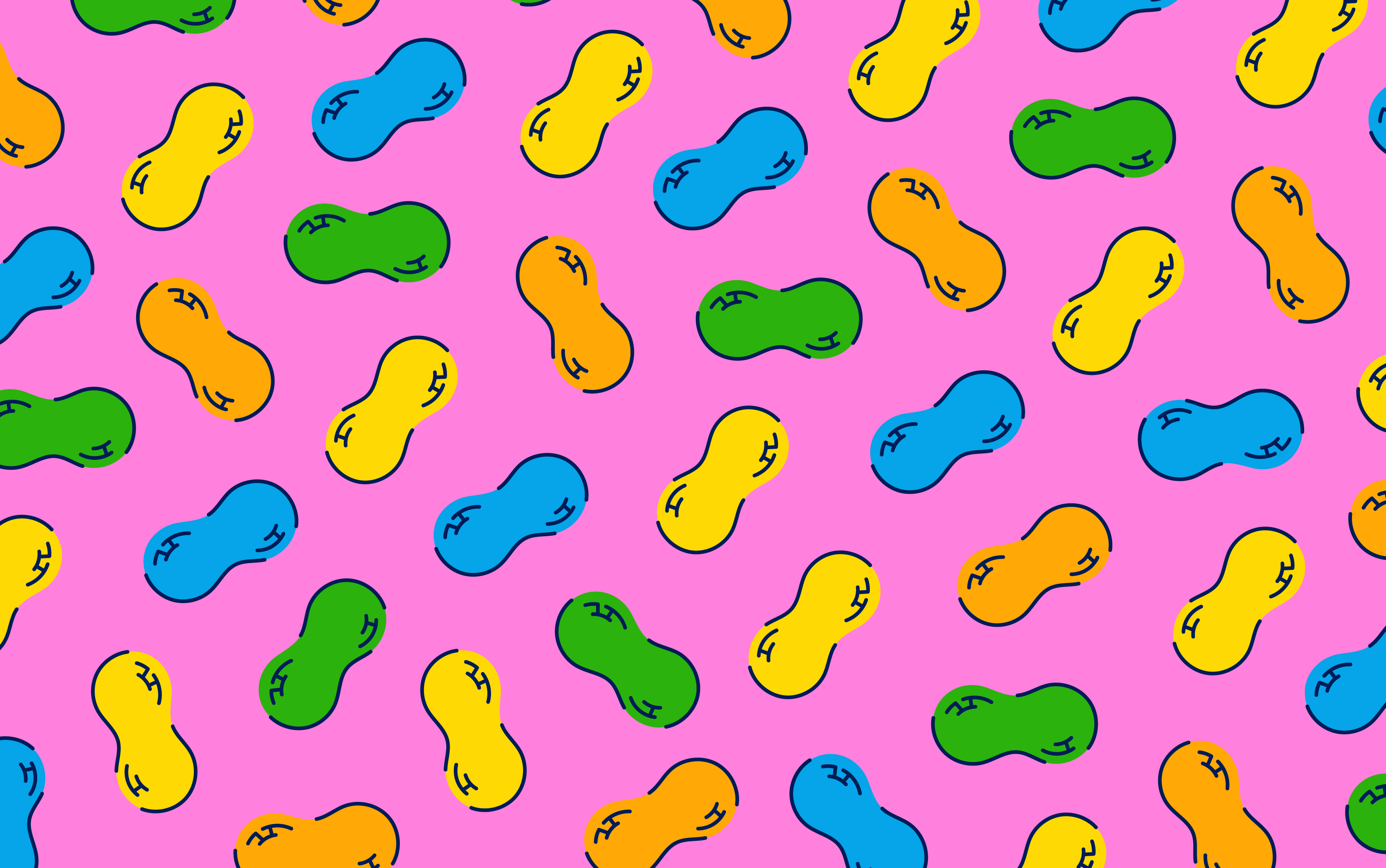
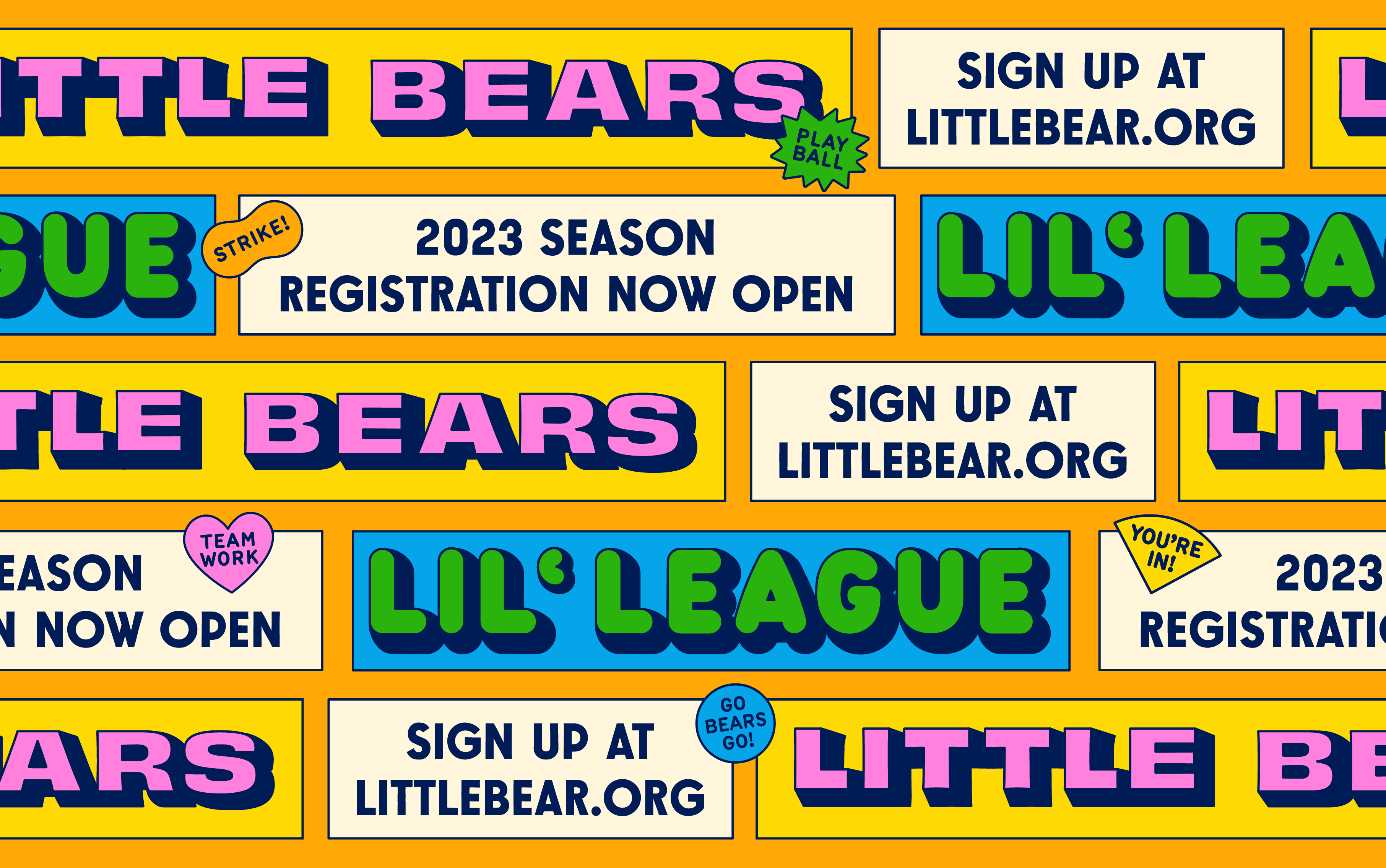
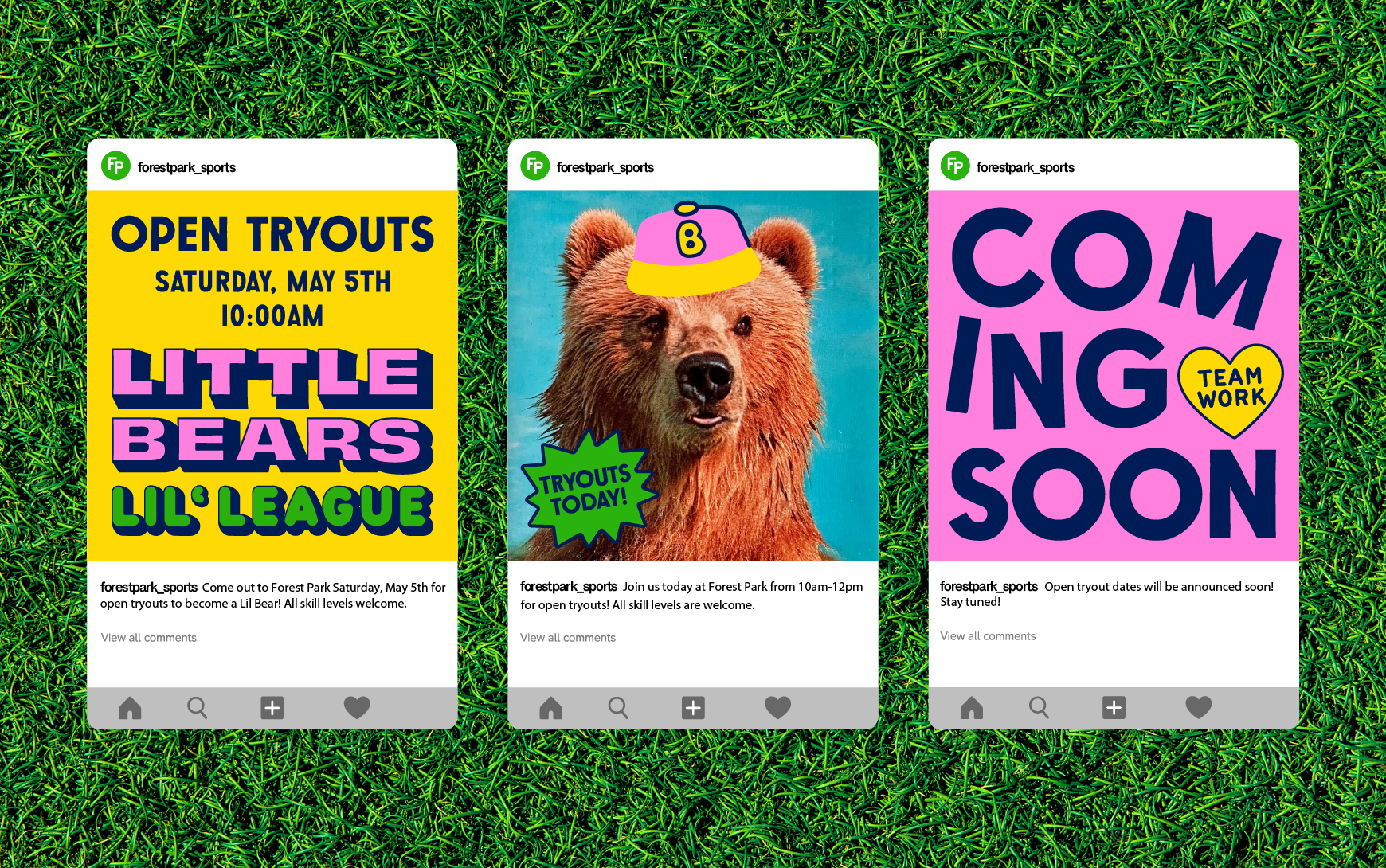
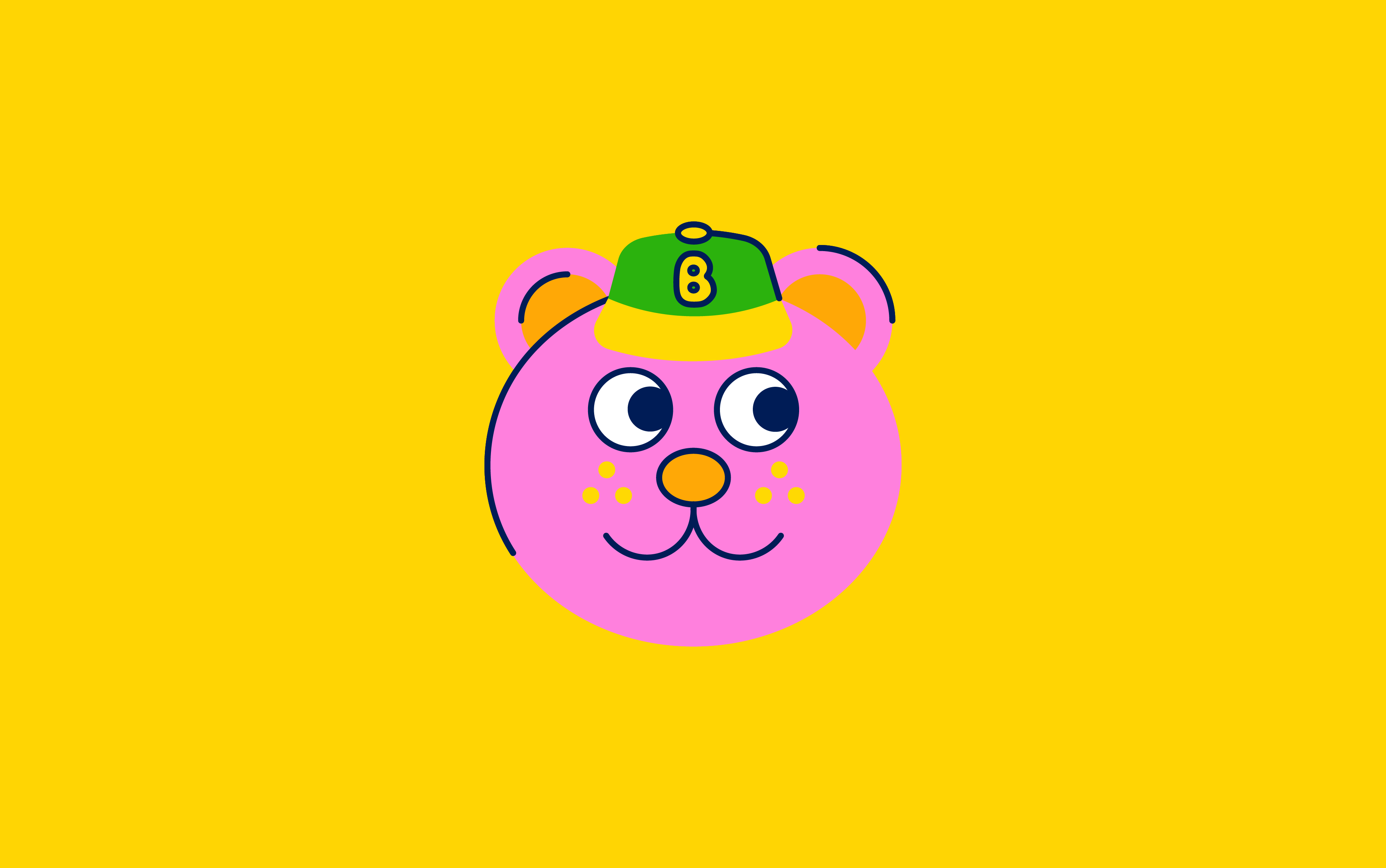
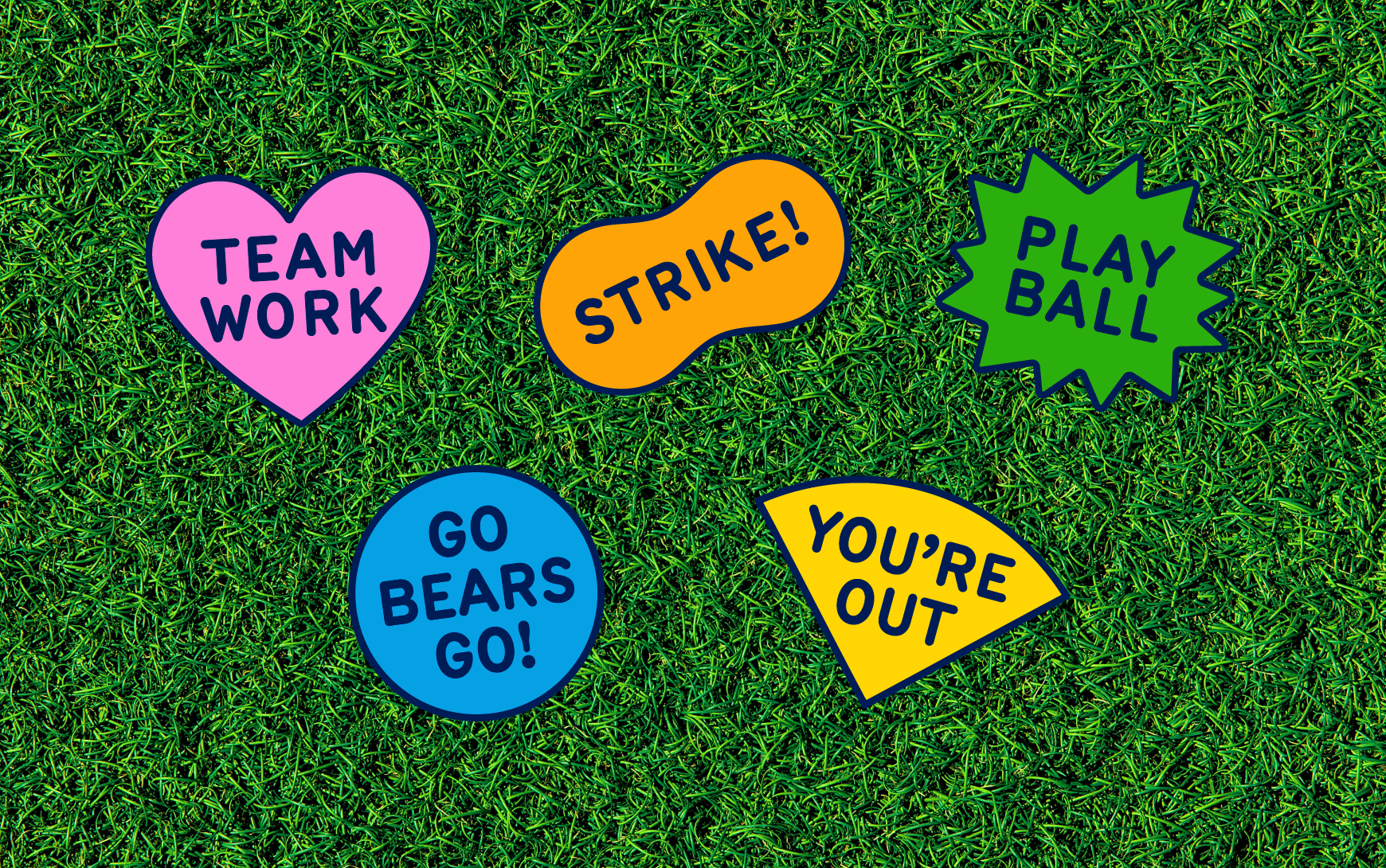
Little Bears is a Little League baseball team dedicated to fostering sportsmanship, skill development, and teamwork among young players. I often feel inspired by vintage sports team paraphernalia and wanted to create a team of my own. I used bright and fun colors to represent the fun and innocence of youth sports, where everyone is welcome regardless of skill level. Little League Bears promotes unity and fun between kids. Yes I made this team up and yes you can contact me if your actual real team needs branding.
︎ Brand Identity
︎ Illustration
︎ Social
Little Bears is a Little League baseball team dedicated to fostering sportsmanship, skill development, and teamwork among young players. I often feel inspired by vintage sports team paraphernalia and wanted to create a team of my own. I used bright and fun colors to represent the fun and innocence of youth sports, where everyone is welcome regardless of skill level. Little League Bears promotes unity and fun between kids. Yes I made this team up and yes you can contact me if your actual real team needs branding.
Highlands Smokehouse
09–05–2020


︎ Illustration
Highlands Smokehouse is a family owned barbeque joint located in the mountains of North Carolina that specializes in smoked meats. I was brought on By Studio Carnley to execute a series of illustrations to support the brand. These illustrations are inspired by vintage National Park ephemera.
Credit:
Art Direction/ Branding: Studio Carnley
Photography: Wes Frazer
The Lake House
08–24–2023


︎ Art Direction
︎ Brand Identity
︎ Illustration
︎ Print
︎ Social
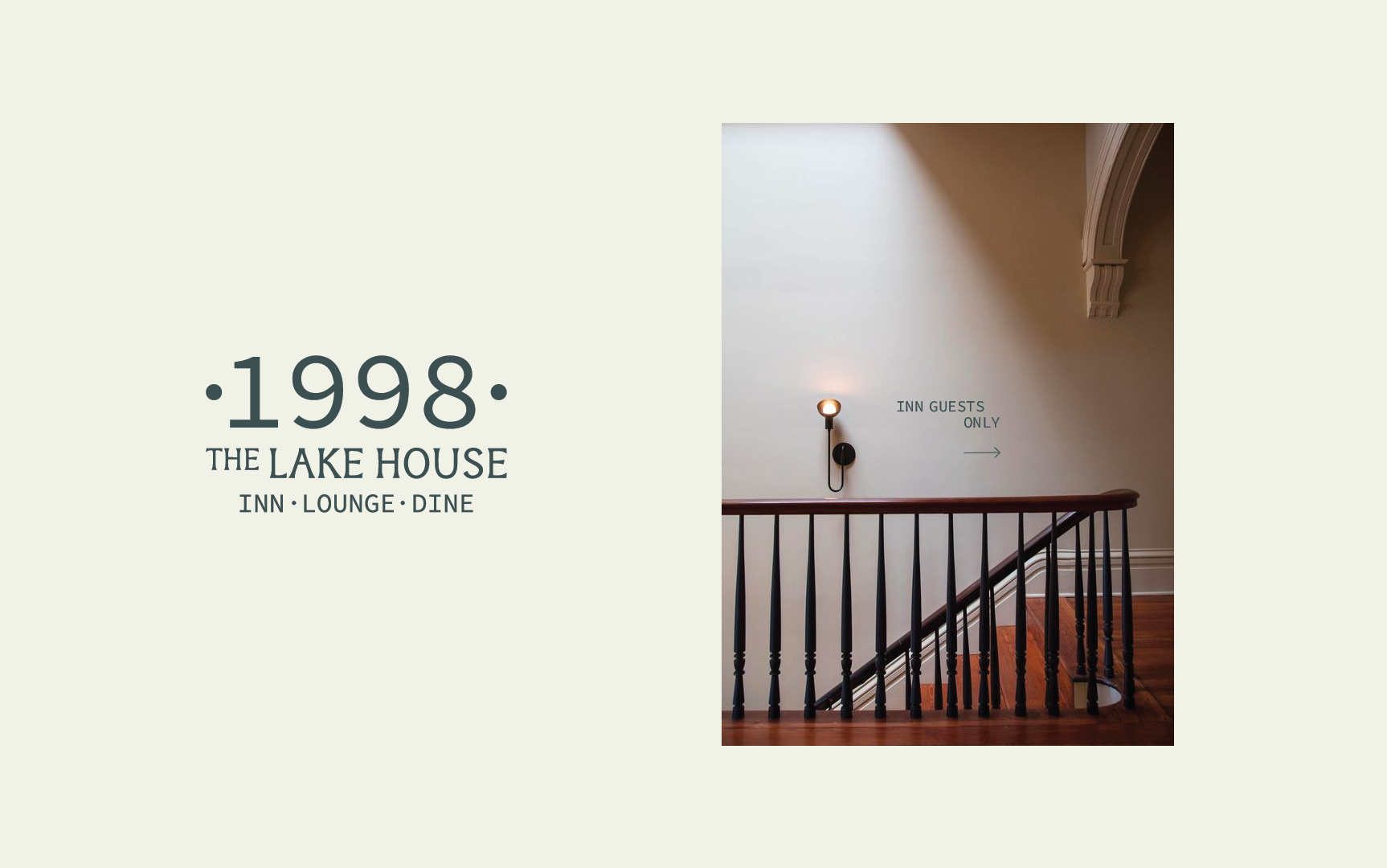
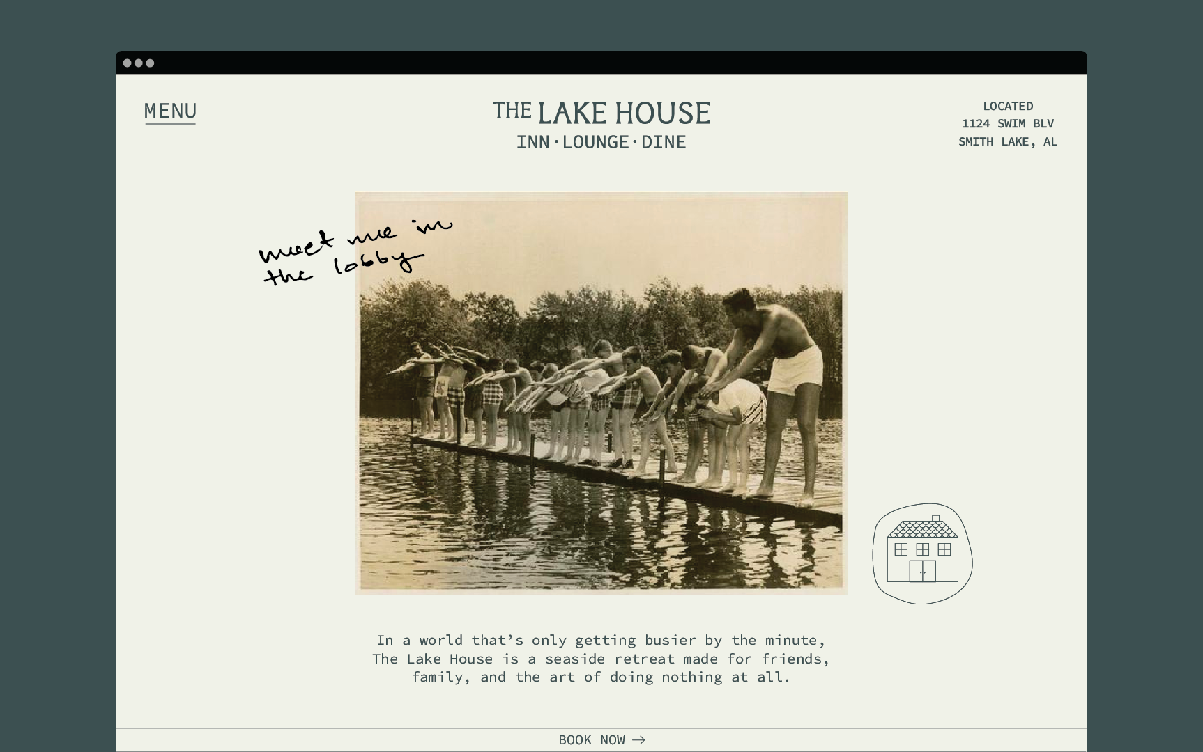
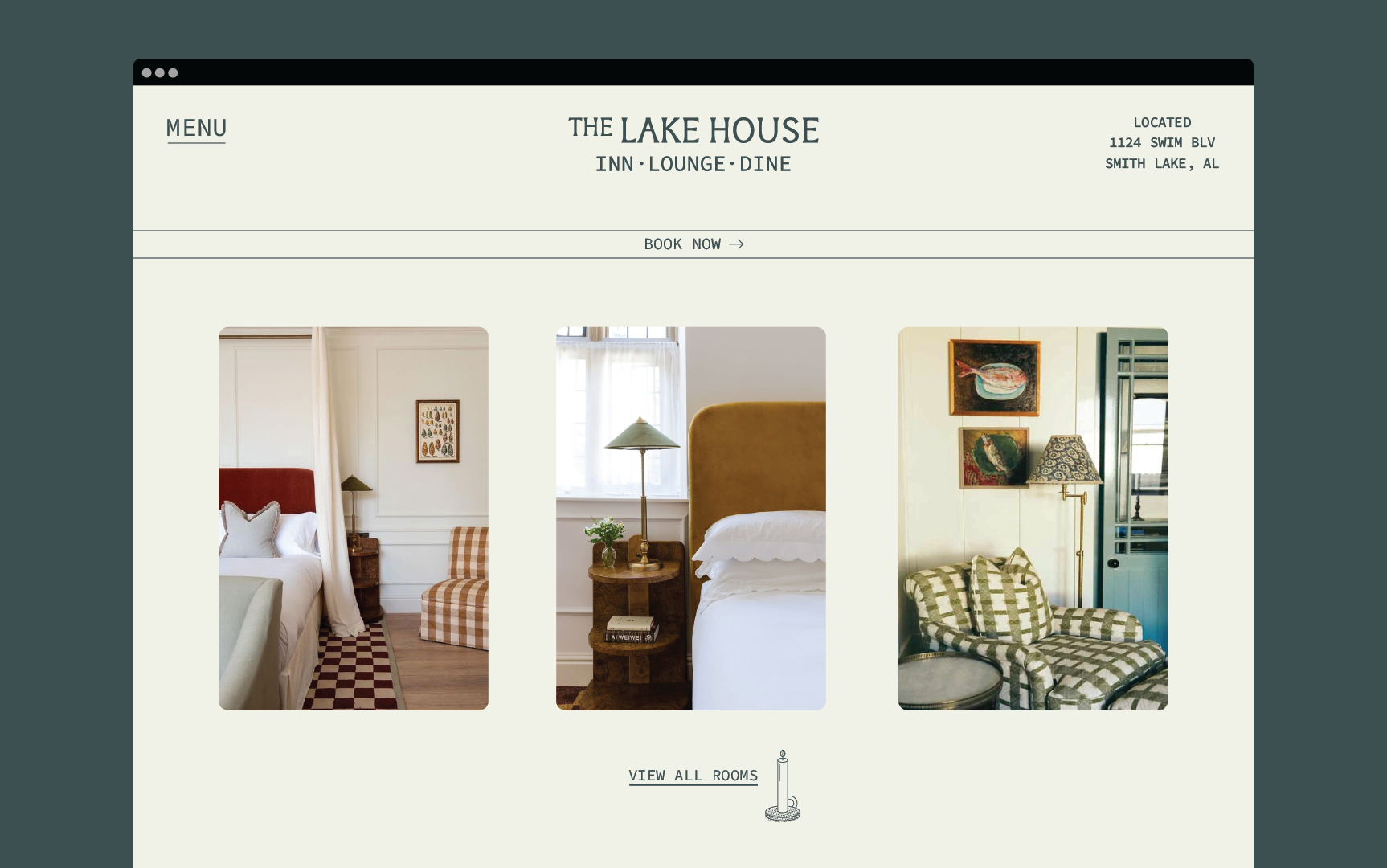
The Lake House Inn was inspired by my slow summers spent on Smith Lake, AL. The Lake House is a lakeside retreat made for friends, family, and the art of doing nothing. I was inspired by the warm, inviting tones found in nature surrounding Smith Lake. These warm tones create a calm and nostalgic brand that represents the sentiments of Smith Lake and its history.
︎ Brand Identity
︎ Illustration
︎ Social
The Lake House Inn was inspired by my slow summers spent on Smith Lake, AL. The Lake House is a lakeside retreat made for friends, family, and the art of doing nothing. I was inspired by the warm, inviting tones found in nature surrounding Smith Lake. These warm tones create a calm and nostalgic brand that represents the sentiments of Smith Lake and its history.
CAMP x Kroger
05–17–2021


︎ Art Direction
︎ Brand Identity
︎ Illustration
︎ Print
︎ Social
Fresh Farms is a partnership between Kroger and CAMP that promotes the idea of eating healthily with the help of Kroger's fresh produce. I was tasked with creating a brand system to support the collaboration. The Kroger team wanted to emphasize their dedication to providing the freshest produce possible to their customers. This partnership invited families to CAMP stores to indulge in farmers market-themed crafts and activities, all while learning about the benefits of fresh produce. Even though Kroger is a nationwide operation, I wanted to encapsulate that feeling of farm to table for them.
︎ Brand Identity
︎ Illustration
︎ Social
Fresh Farms is a partnership between Kroger and CAMP that promotes the idea of eating healthily with the help of Kroger's fresh produce. I was tasked with creating a brand system to support the collaboration. The Kroger team wanted to emphasize their dedication to providing the freshest produce possible to their customers. This partnership invited families to CAMP stores to indulge in farmers market-themed crafts and activities, all while learning about the benefits of fresh produce. Even though Kroger is a nationwide operation, I wanted to encapsulate that feeling of farm to table for them.
CAMP Duffle Bag
03–24–2021


︎ Art Direction
︎ Print
︎ Packaging
︎ Social
I was tasked with creating a set of print and digital assets for CAMP’s latest duffle bag. Drawing inspiration from eye-catching advertisements of the eighties, characterized by bold text and striking photography. Since the CAMP duffle already had a retro look, I thought these nostalgic-like advertisements would be the perfect fit. I also helped with the design development of the CAMP duffle bag.
Credit:
Photography: Grace Hazel